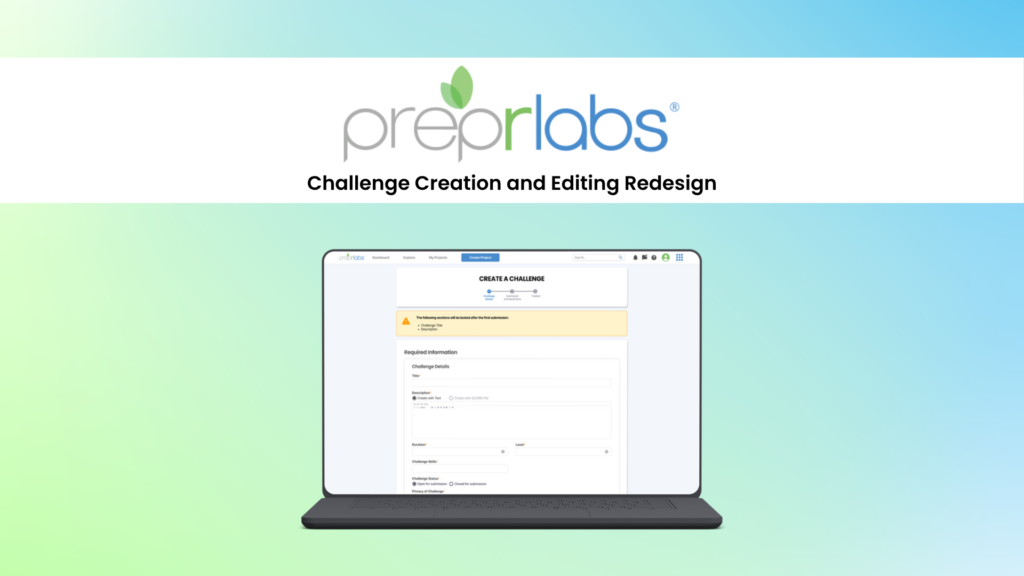
PreprLabs Challenge Creation and Editing Redesign
Reducing complexity and improving the flow in the PreprLabs content creation and editing process.
- Work with instructors and the CEO to reduce the number of steps needed to create educational content.
- Redesign the educational content creation flow from 10 steps to 3.
- Discussed with developers to ensure proper implementation and address feasibility concerns.
- Resulted in ~25% reduction in time spent creating and editing educational content on PreprLabs.
Project Details
Client
Prepr
Sector
Education / Learning Management System
Platform
Web
My Role
- Led discussions with instructors and the CEO to improve the content creation flow.
- Redesigned the content creation and editing flow in Figma.
- Met with developers to address concerns over feasibility and logic.
- Analyzed data in Jira and talked with instructors to measure success.
Tools
Figma, Figjam
Project Context
Prepr is a non-profit organization that partners with educational institutions and industry leaders to provide digital learning programs. As part of their efforts, the organizations created the PreprLabs learning management system to help organize their educational material and facilitate online learning. Instructors would use PreprLabs to set up Labs, Challenges, and Resources to help people manage their learning journey.
Note: The term “Challenge” is what Prepr uses when referring to e-learning content modules. They can be created manually or through the use of SCORM files.
Problem Space
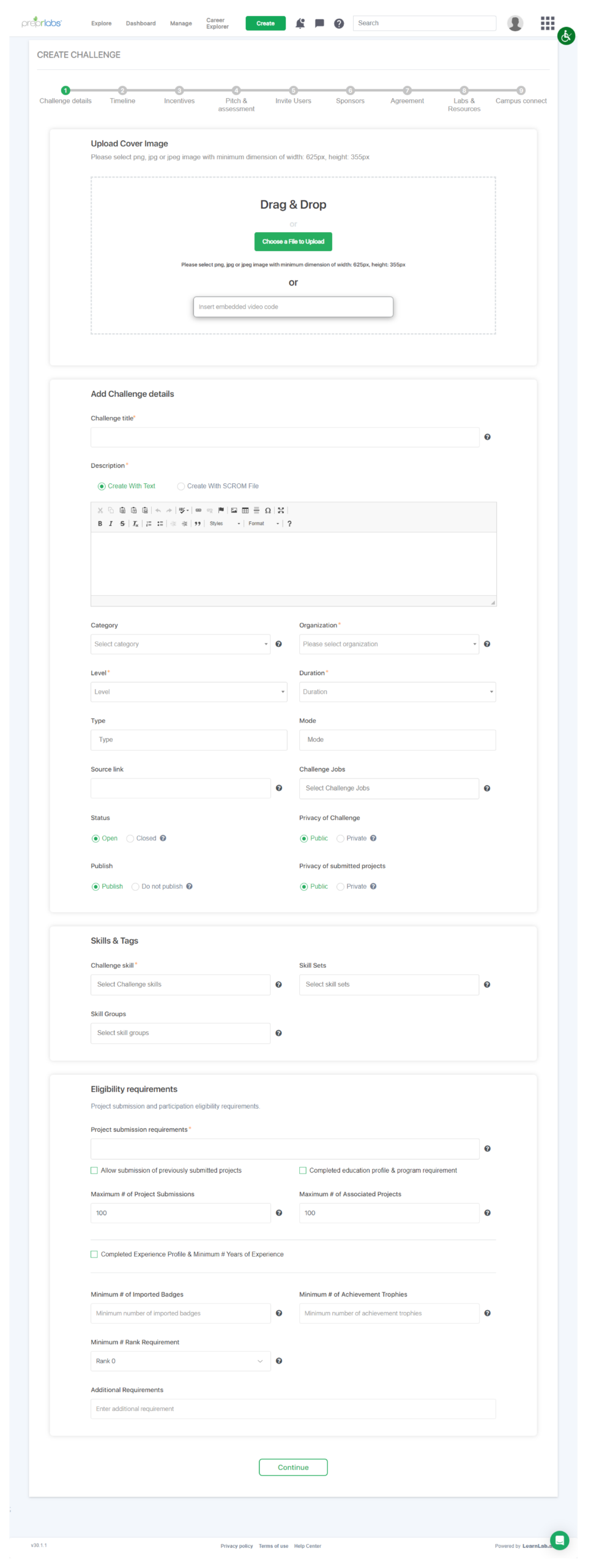
As part of our feedback from both in-house and external instructors, it was relayed to the organization that the content creation process on PreprLabs was tedious and time-consuming. Additionally, it was difficult to edit existing content as instructors were unsure as to why specific fields were locked and had issues navigating the 10 different steps. While each step may only have had 1 to 4 fields to fill out, it was described as “daunting” to complete, and many of Prepr’s own instructors had multiple frustrations trying to setup educational content. Working closely with our instructors, I was tasked with improving the process and redesigning it in Figma.
Outcome
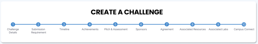
To ensure that the redesign would address both user and organization needs, I set up a workshop discussion with both Prepr instructors and the CEO. In this workshop discussion, we came up with a plan to reduce the number of steps from 10 to 3.

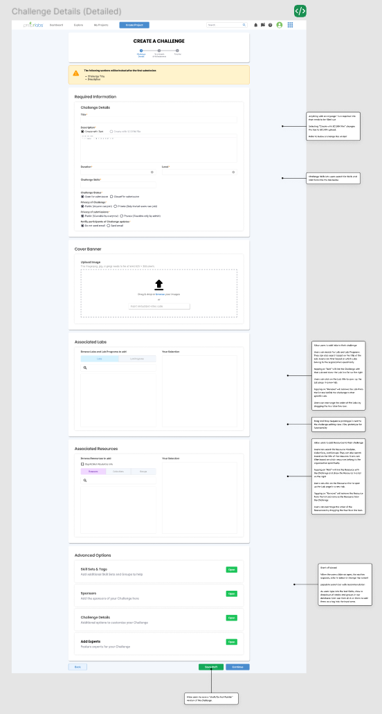
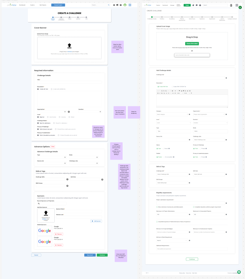
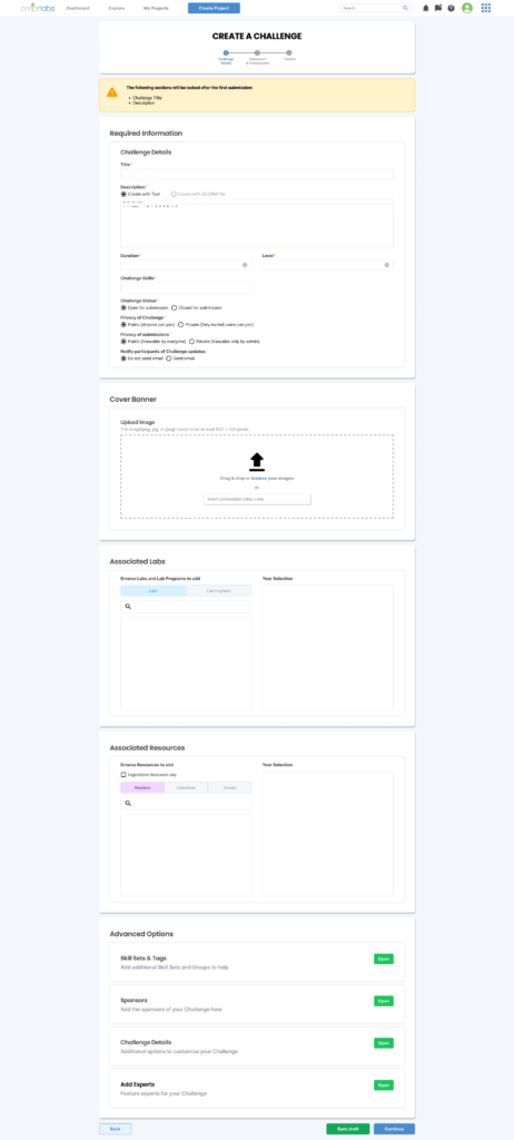
While the number of fields per step had increased, each step made it clear what fields were mandatory and which were optional. Additionally, the optional fields were moved to the bottom and became expansion panels. This was done to prevent overloading the user with too many fields and information. Finally, the status of fields that had the potential to lock in certain scenarios was made more visible to help warn the user.
Once the redesign was completed and implemented by the developer team, I took it upon myself to measure success by taking note of Jira task times and directly talking with instructors. In general, task completion time was reduced on average by ~25%(depending on the task), and many of the frustrations experienced by instructors were gone.
Planning The Process
Workshop Discussions
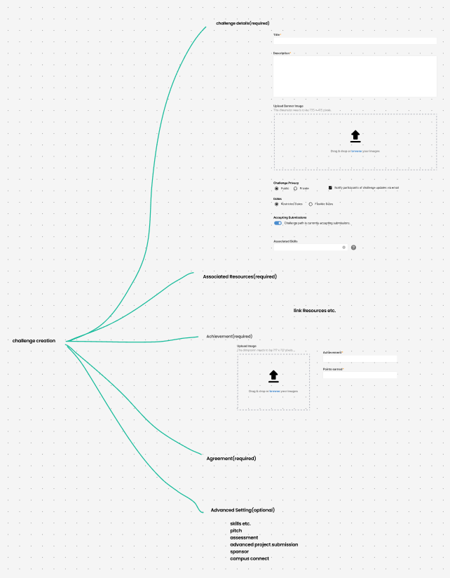
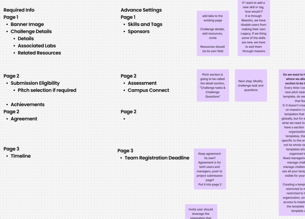
Over the course of multiple workshop discussions with both Prepr instructors and the CEO, we came up with a plan to reorganize the number of steps and rearrange what fields would go under which steps. We first took all the input fields present in the old process, then grouped them up based on similar themes or functions. While originally optimized into 5 steps, it was further simplified into 3 steps.
As I kept working on the redesign in Figma, I would schedule semi-reoccurring design review workshops to ensure that the redesign was moving in the right direction and showcase my progress. Before each workshop, I would setup a list of questions I needed answers to on sticky notes in Figjam. As I presented, I would get clarification or feedback from the instructors and CEO, improving the process further.
The Redesigned Steps
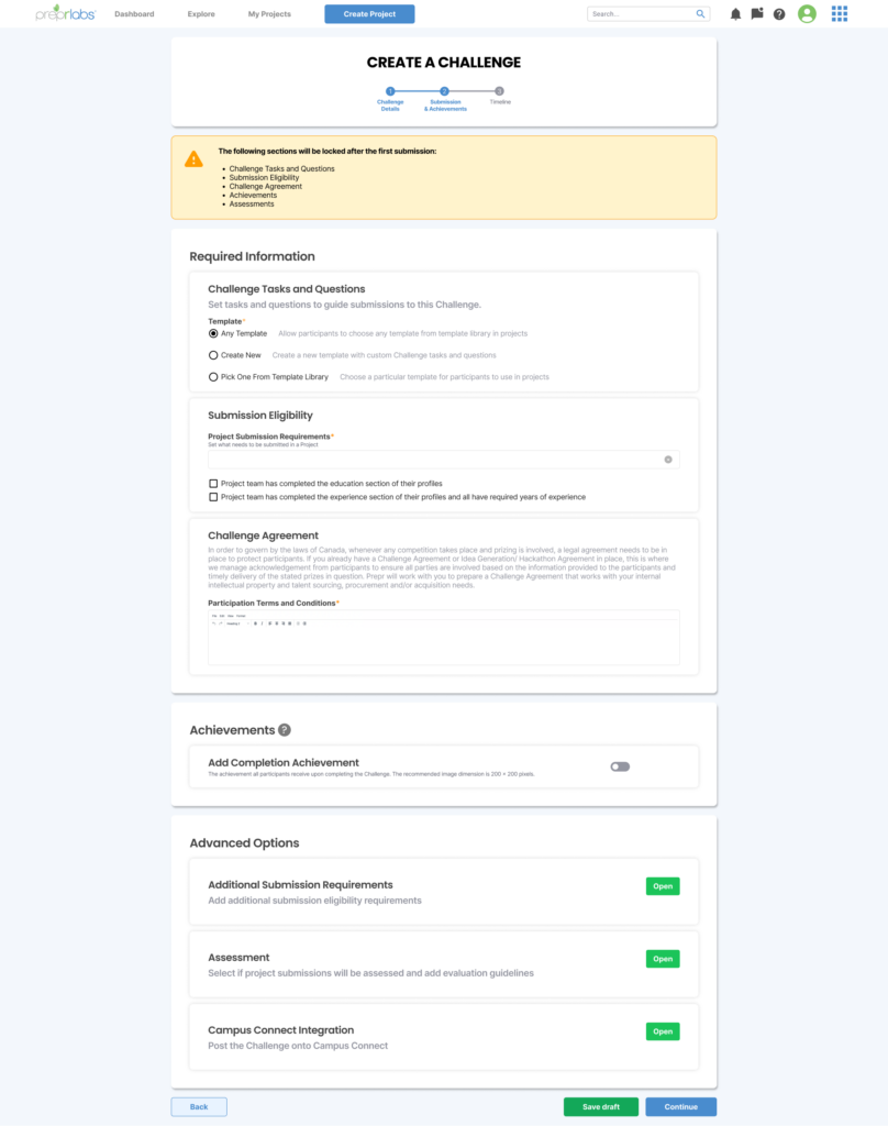
Step 1: Challenge Details
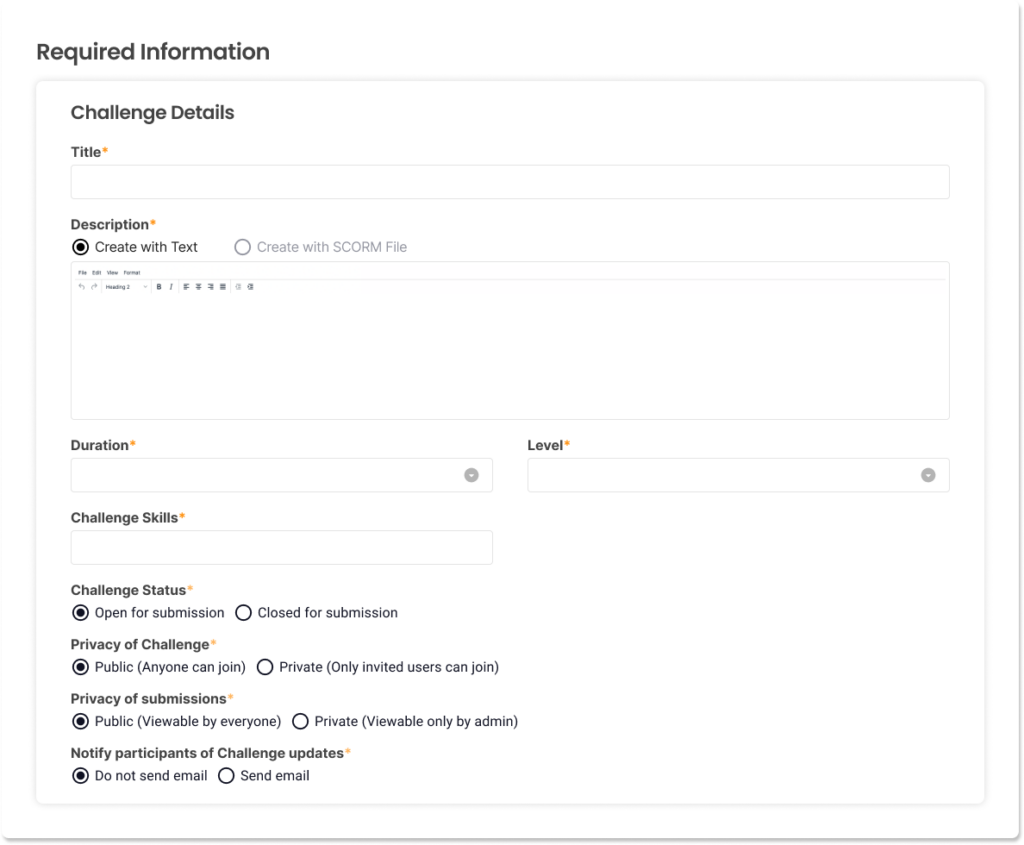
As the first step of the process, it covers the setup of the education content and details. This step encompasses the title, description, level of difficulty, skills to be learned, etc.
Step 2: Submissions and Achievements
The second step focuses on organizing how submissions should be done and what sort of achievement or credential the participants will receive when completing the Challenge.
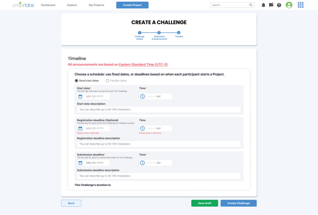
Step 3: Timeline
Lastly, the third step covers when the Challenge will be released and for what duration. Instructors can set it up to release the Challenge on a specific date and when the deadline is. They can either set the specific dates or list a number of days for the Challenge to allow submissions.
Design Changes
Warning of locked fields
At the top of each step, there is a warning that alerts the user that the specific fields will lock after the first submission. The previous design did not have this warning, resulting in instructors being confused to why they can not edit their own content after a participant submits. This warning, in a yellow and orange colour, stands out and is placed at the top to catch the attention of the instructor and alert them.
Required information is always at the top and marked
All required fields are placed at the top in its own section so that instructors would not have to hunt down what fields are required before moving onto the next step. Additionally, they are marked with a red asterisk to help make them more noticeable.
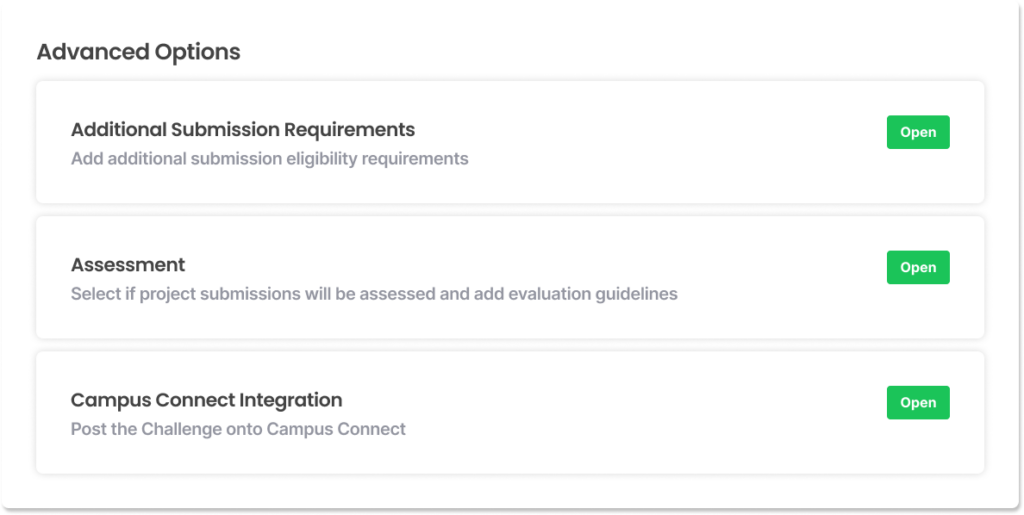
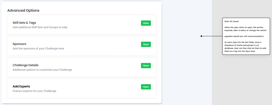
Advance options are placed at the bottom and hidden
More advanced options that are not required to create Challenges are placed in its own section at the bottom and require the instructor to click on them to open. Previously, Instructors mentioned how the number of fields and descriptions everywhere made it confusing to understand what they needed to fill in. Additionally, it overwhelmed them with choices and made it hard to know what they needed to do. By putting these advanced options below and hiding the fields in expansion panels, it reduces the initial mental load of the instructor and gives them the agency to control how much they see.
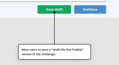
Included a way to save drafts
In the previous process, instructors could not save a draft to complete later and were required to complete all 10 steps if they wanted to save their work. This was frustrating for instructors as they had to keep the tab open just to keep their work if they had to leave or do something else that required their attention. After consulting with the development team, a save draft feature was implemented.
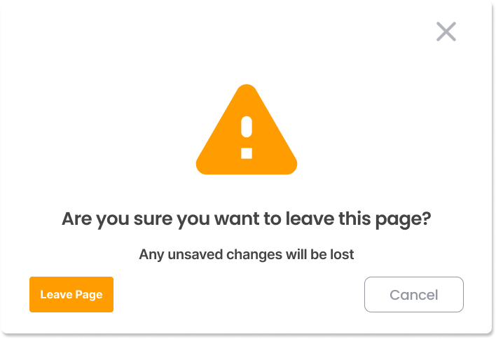
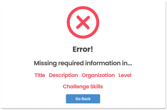
Added warning and alert pop-ups
If the instructor were to leave the Challenge creation or editing page with unsaved changes, they will now get a pop-up that warns them about unsaved changes. This way, we can help prevent accidents from happening that would result in the instructor losing their work. Additionally, if an instructor tries to proceed with the next step without filling in the required information section, they will receive an alert pop-up letting them know which fields they still need to fill out before proceeding.
Annotated notes for developers
As part of the design process, I host discussions with the development team to better understand their design implementation process. In the past, the development team had issue with the UX team due to the old design system issues and lack of context. For many of the screens, the development team had to guess what the expected interaction was and what needed to be displayed at times. To help remedy these issues, I made sure to ask the development team about the feasibility of features and added annotated notes to the design that described the context and interaction expectations.
Measuring Success
To measure the success of this redesign, I interviewed our instructors and checked Jira time spent metrics on Challenge creation tasks a few months after the redesign was implemented. While dependent on the complexity of the Challenge content, the task completion time was reduced by around 25% compared to old Challenge creation tasks. Additionally, our instructors found that the new process was easier to navigate and resulted in less overall frustration when editing Challenges.