Helping Ontarians with Voting Queue Estimates
How might we re-imagine the Elections Ontario app as an essential part of the democratic experience?
- Produce a service map based on the election cycle
- Identify potential pain points and opportunities for improvement
- Brainstorm and iterate on potential ideas
- Present to relevant stakeholders on findings and solution
Project Details
Sector
Government
Platform
Android, iOS
Team
Russell Lau, Rebecca Ding, Yuan Ming, Ying Zuo
My Role
- Planned and coordinated the research plan
- Created and organized the service map blueprint
- Designed the proof-of-concept prototype in Figma
Skills
Service Blueprint, Service Outcome Map, Prototype Sketching, Presentation
Tools Used
Figma, Google Suite, StoryTribe
Project Context
For this project, my team and I were tasked with rethinking the mobile experience of the official Elections Ontario app.
“How might we reimagine the Elections Ontario app as an essential part of the democratic experience-empowering electors to understand, prepare for, and participate in elections, while supporting field staff and creating a direct connection between EO and the people we serve?”
We approached the challenge through a service design lens, focusing on the broader experience of preparing for and participating in an election. My role involved synthesizing findings into a service map, aligning the team around a clear direction, and eventually designing a proof-of-concept prototype in Figma to demonstrate our solution.
Problem Space
Through our research, we identified that the Elections Ontario app lacked features beyond providing a digital voter card. While useful when voting, it did not actively support voters in planning when or how to vote. We also uncovered a broader issue around uncertainty. Many voters lacked clarity about what to bring, what to expect at polling stations, and when the best time to vote would be. A common concern during our user interviews were fears of long wait times and uncertainty when trying to plan their day around voting.
Outcome
To address these challenges, we proposed integrating real-time queue estimates and historical wait time data into the mobile app. This feature would allow voters to see how busy their polling station was at any given moment and compare that data with trends from previous elections. The goal was to support more informed planning and reduce uncertainty by giving voters the information they need to plan out their voting around their schedule, not the other way around.
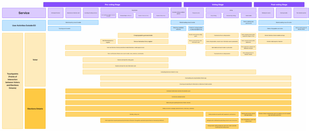
Step 1: Service Mapping
To help the team identify potential opportunities for improvements, we created a service map using the following data sources:
Initial Design Brief

Election Ontario Staff
Election Ontario Website
Five User Interviews
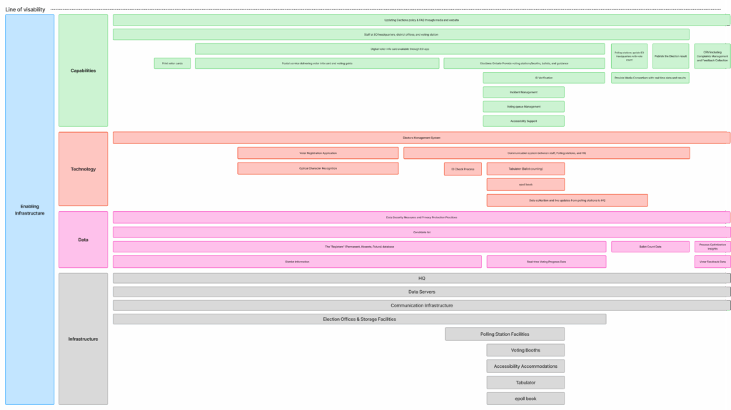
Elections Ontario Service Map
From there, we mapped out the full voter journey. It starts with the pre-voting stage, then the voting stage, and finally ends with the post-voting stage. In each stage and their respective sub stage within, we mapped out the key touchpoints between voters and Elections Ontario. Additionally, we mapped out the back-end processes and technology that ensure smooth operation.
Findings
Based on our findings and the service maps, we identified three major insights that helped guide our solution:
How can we update the Elections Ontario application to better prepare Ontarians for elections and reduce barriers that may hinder them from voting?
Step 2: Ideation
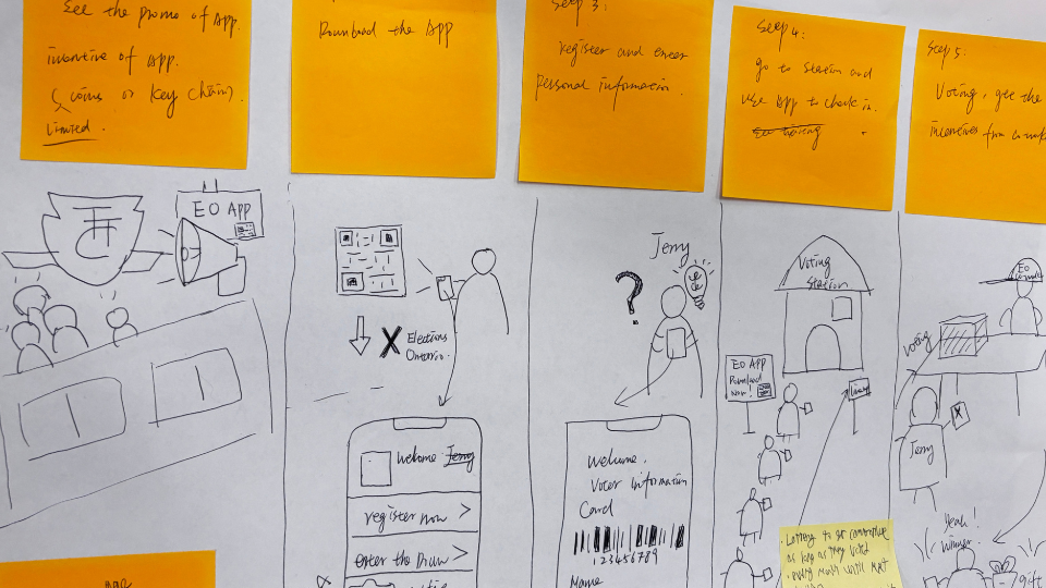
After sketching out multiple different ideas, my team picked two promising ideas that could address the issues of voting motivation. We then sketched out storyboards for them and asked our peers for their opinions.
Idea 1: Providing Incentives for Voting
Our first idea was to provide a way for voters to sign up using the mobile application to received a commemorative badge or keychain.
This way, Ontarians are motivated to participate in voting if they were able to gain something and add additional potential value to the election voting process.
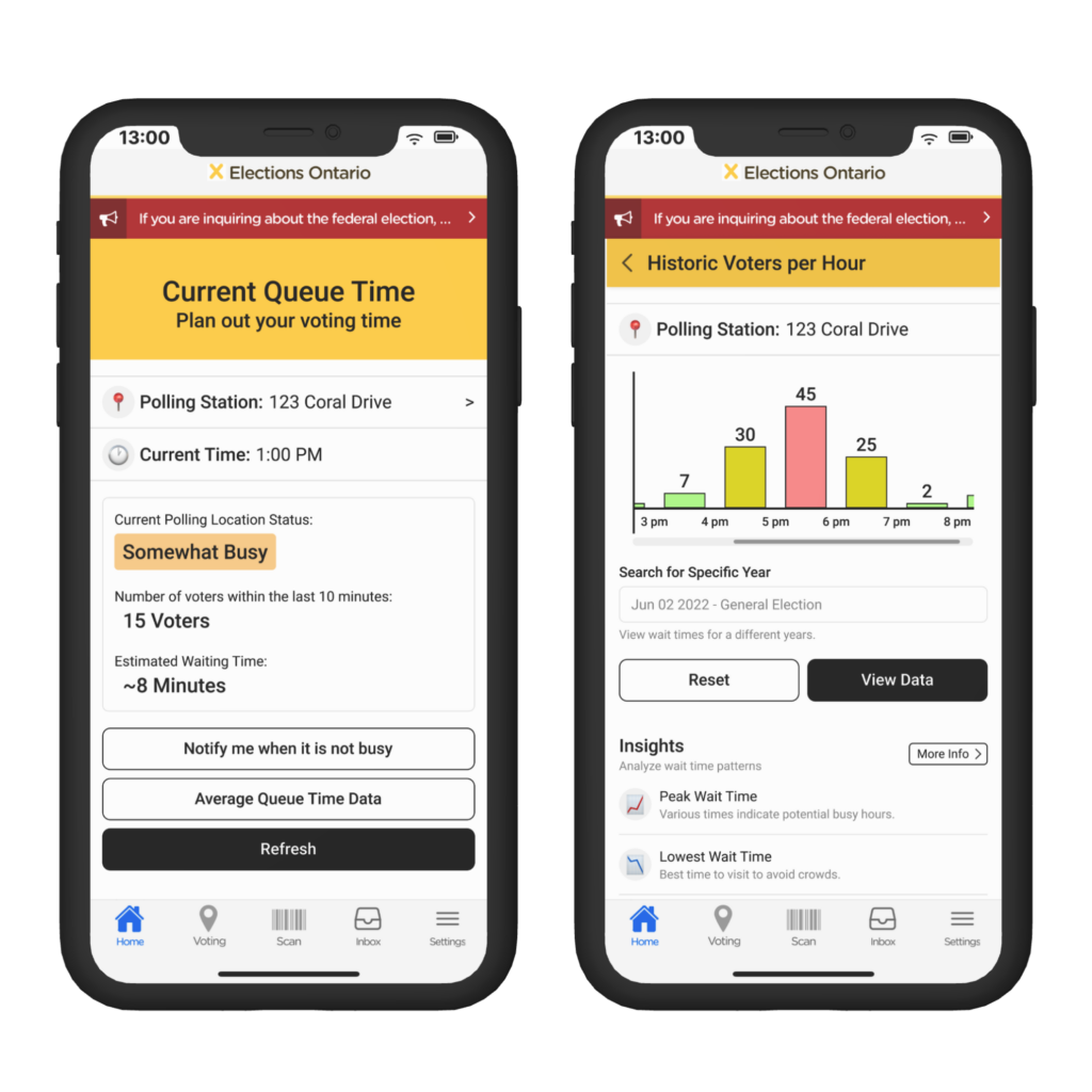
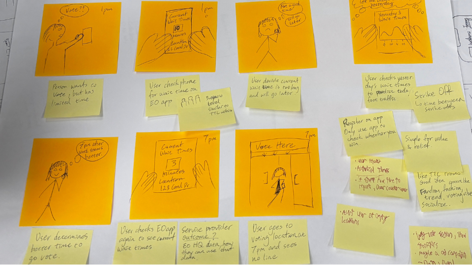
Idea 2: Estimated Wait Times
The second design focused more on reducing barriers to vote by providing voters with the necessary data to plan out their voting around their schedule.
More specifically, showing voters the potential wait times of their polling station and the historic wait times for them to decide when they should go and vote.
After discussing over these ideas and gathering feedback on them from our peers, we decided to go with the estimated wait times solution. This was chosen as it was considered easier to achieve, had more impact, and provided a clearer value to use the Elections Ontario app.
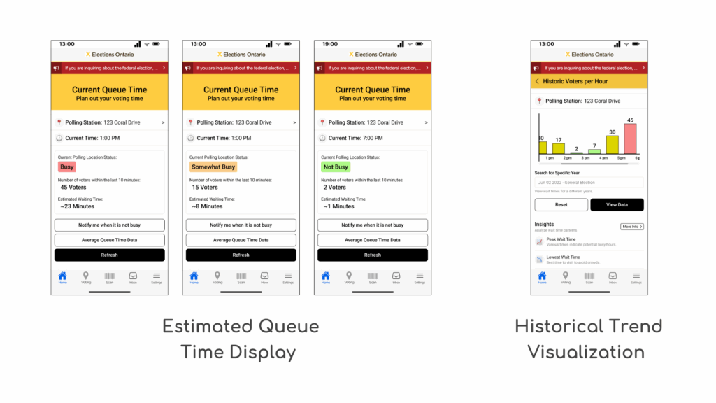
Step 3: Proposed Solution
After deciding on our solution, we created some high fidelity screens to showcase what the solution could look like if implemented. Voters can select a polling station and see the current waiting times. After talking with Election Ontario staff about our idea, they mentioned how we could also access the historic data to see how busy the polling station is at specific times based on past election data. I created these mock-ups of our solution in Figma as a proof of concept.
Storyboarding
To gain a better sense of how our solution can help voters overcome voting barriers by seeing estimated wait times, we created a storyboard to showcase a potential scenario of our proposed solution.
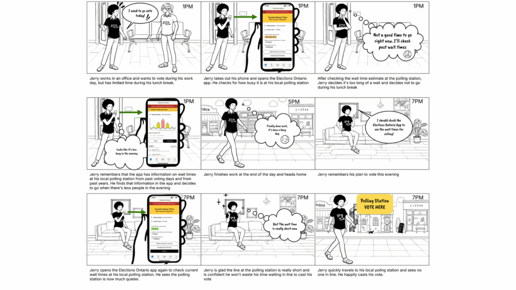
As we can see from Jerry’s story, our solution has the potential to help voters plan out their voting times around their own schedule rather than assuming when it is empty. By making this data more transparent, we can help voters plan ahead of time and reduce high traffic times at polling station. This data is also helpful for Elections Ontario to better manage voter foot traffic and help improve staff workload.
Step 4: Key Considerations and Implementation
Key Processes and how it works
Our solution is comprised of two key processes.
Firstly, showing electors the current queue time of their local polling stations. This is done by taking advantage of the Voter View software, which collects real-time strike off data. This can be used to display the number of voters within the last 10 minutes. The more voters, the busier the polling station perceived to be.
Secondly, provide electors the information and data needed to help them determine the best times for them to vote. This will leverage the strike-off data in the elector management system from past elections. Then we can show the average voters per each hour across all the days voting was available for that location.