UofT EventNest
Designing a mobile app to help UofT students engage with campus clubs and events they are interested in.
- Identified the needs of UofT students and their expectations regarding attending club events.
- Designed an interactive prototype that matches UofT branding and adheres to accessibility design principles.
- Communicated with the client on a regular basis to manage expectations and align goals.
- Based on a concept provided to the University of Toronto through a hack-a-thon.
Project Details
Client
University of Toronto St. George | Mobile Application Development Lab (MADLab)
Sector
Community and Social Networking
Platform
Android, iOS
Team
Russell Lau, Winny Peng, Francesca Cheng, Chloe Ho
My Role
- Led weekly communications with client and organized meeting notes
- Organize group meetings and facilitated discussions
- Conducted user interviews with a variety of UofT students
- Designed the search, date filter, and event page interactive prototype
Skills
Semi-structured User Interviews, Usability Testing, Survey, Design System, Prototyping, Client Communication, Mobile App Design
Tools
Figma, Figjam, Google Suite
Project Context
For this 12-week capstone project, I worked on a team partnered with the University of Toronto Mobile Application Development Lab (MADLab) to design for EventNest, a new mobile feature for the University of Toronto official app.
The goal was to make it easier for students across all three campuses to discover and keep track of club events. The concept started as a hackathon idea, and our role was to conduct user research and design an accessible user interface for students. I guided the project from early discovery through final prototype, helping structure our research plan, define the problem space, and lead design iterations.
Problem Space
We quickly learned that event discovery at all UofT campuses felt scattered. Most students relied on email newsletters or Instagram posts, which made it easy to miss events. For students that did not regularly attend club events, they were unsure where to look for events and usually gave up after trying. The official student organization portal was outdated and hard to navigate, resulting in a lack of usage by students. Compared to other university mobile applications, UofT’s app lacked even the most basic features to help students find local clubs and events.
Students weren’t disengaged because of a lack of events.
They were disengaged because finding relevant events was inconsistent and took too much effort.
Outcome
After the research phase, we identified consistent pain points:
- Difficulty filtering events
- No centralized place to track interests
- Limited reminders
- Challenges planning around busy schedules.
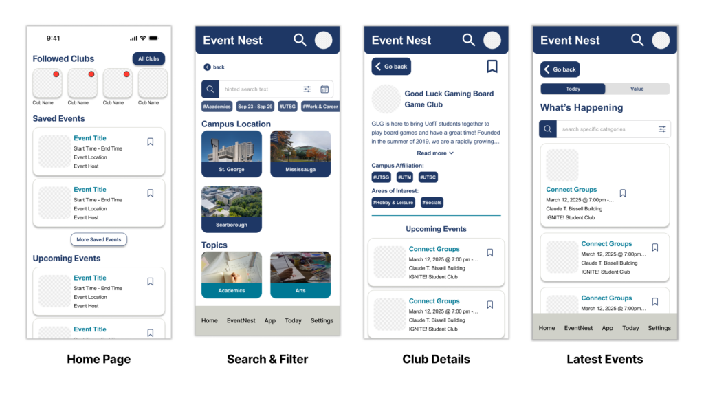
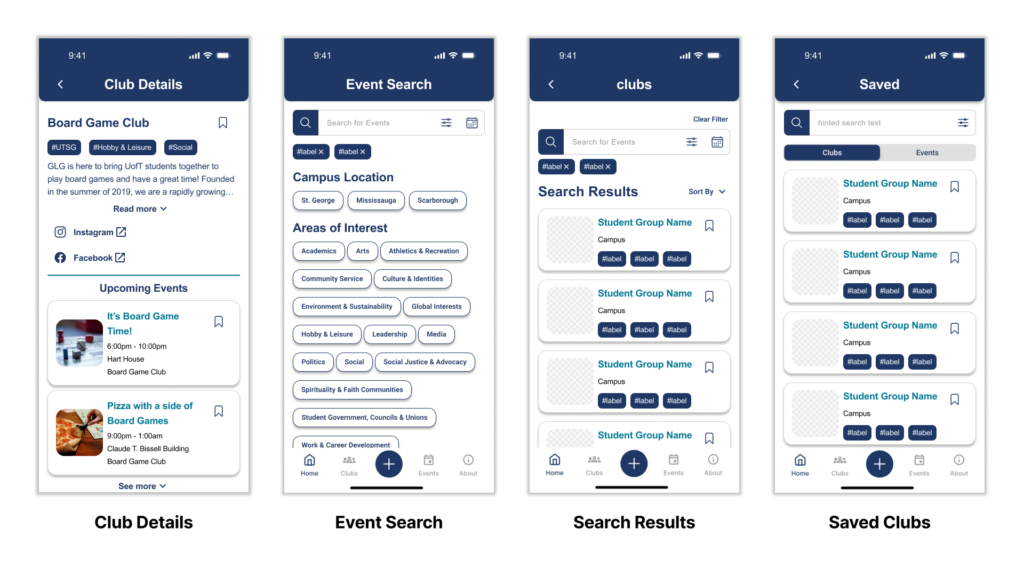
Working closely with MADLab, we created an action plan that detailed what features our designs should include and tested our designs with UofT students. The final outcome was a fully interactive high-fidelity prototype that allows students to:
- Look up current and future club events at all three campuses
- Search and filter for specific clubs that match their interest
- Easily look up club or event details
- Save clubs or events for future reference
We then delivered the prototype to the MADLab team for potential implementation and received approval of our work by the client.
Research Process
Secondary Research
We began by conducting secondary research to establish a foundation of what could be done with our deliverables. Part of this process involved conducting a competitor analysis of other university application. We analyzed apps from Rutgers, Penn State, and Queen’s university. Our overall finding was that while these apps do support their students, they only provide basic event features and did not allow the student to personalize their experience.
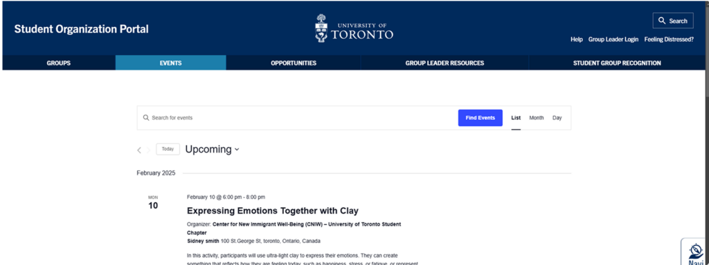
Another part of this research was reviewing already existing practices for event management and promotion used by UofT clubs. At the time of research, students only had a few limited ways of discovering clubs and events. Other than monthly newsletters and social media, there is a Student Organization Portal. However, the web portal is infrequently updated and does not properly reflect all potential events happening on campus.
Primary Research
Survey
To gain a better understanding of how both UofT students and clubs interacted with each other, a survey was created and sent out that asked basic question regarding discovering club events. Only registered students from either UTSG, UTM, or UTSC could participate. During the screening, respondents could identify themselves as either non-club or club members.
In total, we got 50 respondents with the primary demographic being upper year graduate students. Some interesting finds include:
48% of non-club members do not regularly attend any campus events
69% of non-club members rely on emails/newsletters for information
52% of club members rely on Instagram for event information
User Interviews
As part of our primary research, we conducted semi-structured user interviews to gather context rich qualitative data. This would help us dive deeper into the potential pain points and opportunities we could address with our design.
To better address our target audience and gain a more comprehensive perspective, I proposed that we should interview both club executives and potential students in addition to UofT students. By interviewing club executives, we can gather data on how current clubs engage with students and organize events. With potential students, they provide important data on the new student experience and what sort of expectations they may have when trying to find campus clubs or events.
Adding onto that, I also made sure that we had at least two students from each of the three UofT campus participate in the user interviews. This was done as students may have different experiences with event discovery depending on their campus. We could also then ask them about their experiences attending events at different campuses.
Each session were 30 minutes long and were tailored depending on their demographics (Club Executive, UofT Student, Potential Student). The session consisted of questions regarding:
- Demographics
- Current event discovery and behaviours
- Technology usage for event discovery & management
- Pain points and opportunities
In total, we interviewed 12 participants.
5 Club Executives
To learn how clubs or student groups promote their events and their communication methods.
- 4 clubs, of which 2 host multi-campus events
6 UofT Students
To understand how UofT students discover campus events and what influences their decision to attend or not.
- 2 students from each campus (UTM, UTSG, UTSC)
- Mix of both undergraduate and graduate students
1 Potential Student
To discover what sort of expectations potential students may have going into UofT and explore opportunities to support their first year regarding campus events.
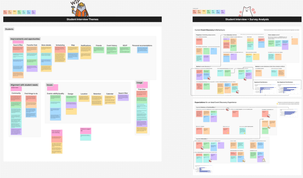
User Interview Findings
After synthesizing our interview research data, we found that:
Opportunity
After presenting our findings with our client (MADLabs), we discussed potential opportunities that EventNest could address and created a list of features to include into our design. To narrow our design scope, my team and I voted on what we thought were the most feasible and impactful features to include in our design.
General Features
- Event filter system w/ categories
- Reminders & Notifications
- Event attendance history
Event Details
- Expanded event titles and descriptions
- Highlight Incentives/amenities
- Event location and navigation/wayfinding
Personalization
- Personalized event recommendation
- Event Scheduling/Calendar
- Follow student groups and organizations
- Ability to RSVP events
Design Process
Mid-fi
Due to the short time frame of the capstone and with client’s approval, we decided to start with a mid-fi designs in Figma. Using the identified opportunities above as a guide, this first iteration of the designs was made roughly so that we could start to collect feedback and iterate on ideas quickly.
Quick User Interviews
To check and see if the designs were on the right track, we conducted guerrilla testing with four UofT students. From this, we learned that our design had multiple accessibility and usability issues. Additionally, some features that the client wanted to be done a specific way were not intuitive. For example, the “Followed Clubs” at the top of the homepage was received negatively by our participants as it was distracting and inconsistent with the rest of the design. To remedy this, we organized a discussion with the client and advocated for a design that was better supported from user research.
After meeting with the client and discussing potential directions for the project, we were given approval to rework the information architecture of the EventNest feature and rework features to better suit user needs. We then created the second iteration of the designs. Rather than having a home page, our design now featured a club and event tab in the navigation due to client requirements. Additionally, we focused on making sure that information being presented in the UI was clearer and relevant to the student.
Usability Testing
To validate our design changes, four usability testing sessions were arranged with UofT students who have not participated in our initial user interviews. Participants were given 20 minutes to interact with our prototype and encouraged to think aloud while being observed. To encourage navigation, we presented them with general scenarios that student may encounter when using the app. Afterwards, a 8 minute post-activity discussion was used to help target specific action and thoughts they had during the session. While the app’s design was received positively by each participant, there were a few issues that needed to be addressed.
Synthesized Findings
- The calendar feature was not intuitive and took too many actions to complete
“The calendar is weird […] it shouldn’t be more than one click away […] right now it doesn’t make sense for me to click here and then here and here to see the results” -P02 - Confusion over searching and using the filter
“At first, I was confused when the search didn’t do anything right away […[ expected it to show results instantly or have a more obvious search button.” -P01 - Issues with clarity on the event detail page and missing important details
“Didn’t notice the RSVP link, but then realized it was there,” and later added, “If the RSVP is internal, then a button would feel cleaner and more user-friendly.” -P01 - Student group page was too cluttered, making it hard to scan for information
“If there’s a way to make it like there to be less text so close together.” -P04 - Participants found the Saved List feature to be useful, but had issues with navigation
“I like having multiple tabs open when researching something… I prefer to save clubs I’m interested in rather than click into each one.” -P04
“it’s weird that it’s here and not [where the ‘about’ tab is] at the bottom” -P02 - Navigation issues with locating EventNest features
“I kind of expected to start looking [where these tiles are] instead of down here [in the navigation bar] because everything is kind of drawing my attention here and I didn’t realize I should be looking down here instead” -P03
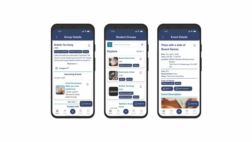
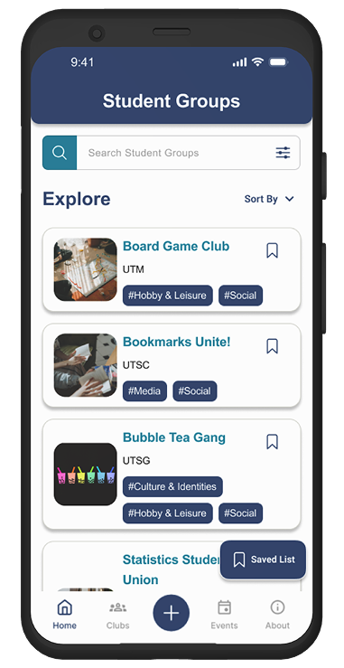
Hi-fidelity Prototype
After analyzing the user feedback, we then created the hi-fi version of our designs and updated them to reflect user needs. Some of the changes we made include but are not limited to:
- Redesigning the calendar feature to more closely follow Apple’s Human Interface Guidelines and Andorid’s Material Design System 3.
- Added more spacing between elements and components to help with readability.
- Changed the search filter flow to only apply when the user selects apply after picking tags.
- Made important links like “RSVP” and “Add to Calendar” into buttons, making it easier for students to see.
- Placed a floating action button in the bottom right of the screen for “Saved Lists” for easy access.
As part of the deliverable expectations, an interactive prototype was created to showcase the mobile application flows and help with development. If you would like to know more about the hi-fi prototype or interact with it, feel free to contact me!
My Contributions
- Led discussions on the initial and revised information architecture of the mobile app.
- Organized and facilitated team meetings to align on design decisions and coordinate work.
- Designed the Club Details, search, and filter results pages.
- Conducted usability testing with a UofT student and synthesized qualitative insights.
- Ensured consistency and standardization across screens using the design system.
- Created empty states to guide users when no data was available.
- Revamped the calendar and time filter to better align with client goals and client needs.
- Built the fully interactive high-fidelity prototype.
- Presented final deliverables to the client and received approval.
Reflection
Looking back, this project taught me a lot about managing client expectations. As it was our first time working with an external client, a few challenges emerged due to misaligned expectations early on. While there were some surprises at the beginning, I quickly learned how to proactively manage expectations and clearly communicate our process during weekly meetings.
Before each client meeting, I prepared a FigJam board to document notes and aligned with my team on any questions we wanted to raise with the MADLab team. During the meetings, I provided updates on our progress and intentionally turned discussions into collaborative working sessions. This approach helped both sides stay aligned, clarify assumptions early, and minimize unexpected changes later in the project.